The U.S. 10-year minus 3-month Treasury spread stayed inverted for an unusually long stretch. Why the duration matters, what history actually proves, and which warning signs investors should watch now.
October 15, 2026 · Economic Analysis · Estimated reading time: 10 minutes

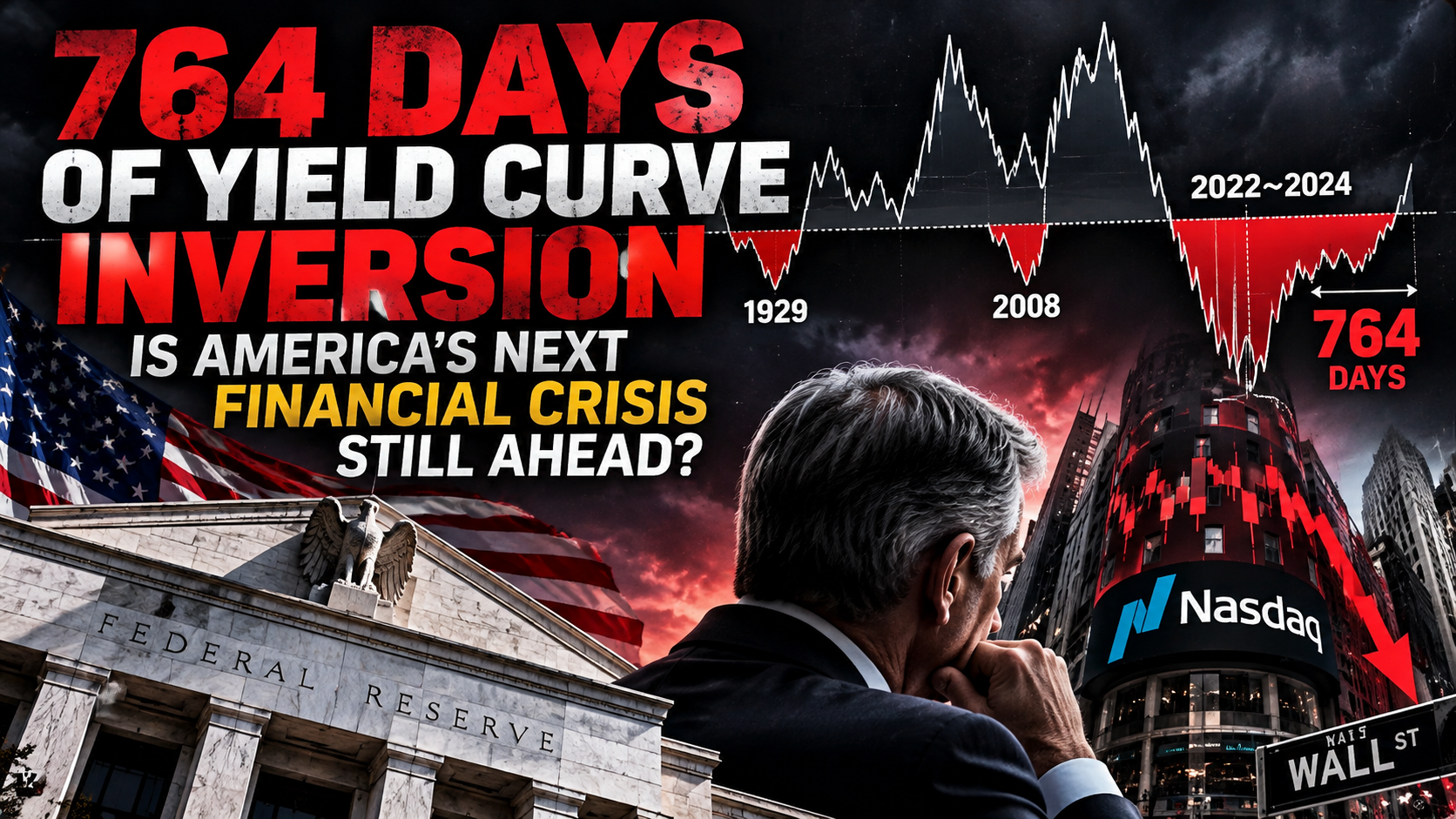
One of Wall Street’s most closely watched recession indicators delivered an extraordinary warning in the last cycle: the yield on short-dated U.S. Treasury bills exceeded that of 10-year Treasury notes for roughly two years. A widely circulated chart labels the episode as 764 days of inversion. That figure is striking—but the number alone does not predict a crash.
What makes the signal economically important is the mechanism beneath it. A persistently inverted yield curve can indicate that monetary policy is restrictive, near-term financing remains expensive, and bond investors expect weaker growth or lower short-term rates ahead. Over time, those conditions can strain borrowers, banks, and the wider credit system.
The question is not whether the United States has reached a magical recession countdown. It is whether the effects of that extended tightening period are now emerging in employment, corporate refinancing, credit availability, and the stock market.

1. Why Does the Yield Curve Invert?
Under many ordinary conditions, longer-maturity Treasury securities yield more than short-term bills. Investors generally demand compensation for tying up money over longer periods and accepting interest-rate uncertainty. But the relationship can reverse when the Federal Reserve keeps short-term rates high while investors expect inflation, growth, or future policy rates to decline.
The 10-year minus 3-month spread is particularly useful because the 3-month bill is closely connected to current monetary policy, while the 10-year yield embeds expectations about future short-term rates as well as a term premium. A negative spread therefore often captures the tension between tight policy today and weaker conditions tomorrow.

2. Why Does a Long Inversion Matter More Than a Brief One?
The strongest argument is cumulative exposure. A business with a fixed-rate loan may initially be insulated from higher borrowing costs. The same business can face a severe cash-flow squeeze when the loan matures and must be refinanced at a much higher rate. The longer restrictive rates persist, the greater the share of outstanding debt that eventually rolls into the new interest-rate environment.
Households face similar timing effects through credit cards, adjustable-rate borrowing, auto loans, and new mortgages. Banks may encounter higher deposit costs, unrealized losses on older fixed-rate securities, and weaker credit demand. In response, lenders can tighten standards, reducing the availability of capital precisely when borrowers need it most.
These channels do not operate at the same speed. That is why an economy can look surprisingly resilient long after a yield curve first inverts—and why an eventual slowdown can seem abrupt even though the pressures accumulated gradually.


3. History: A Powerful Signal, but Not a Perfect Forecast
Yield-curve inversions preceded several major U.S. recessions, including the downturns associated with the early-1980s tightening cycle, the dot-com bust, and the 2007–09 global financial crisis. Yet the mechanism and severity differed in each case. The dot-com episode centered on collapsing technology valuations and business investment; the global financial crisis involved housing, securitized credit, and banking-system fragility.
Importantly, not every recession was a financial crisis, and not every inversion has been followed by a recession on the expected schedule. The prolonged 2022–24 inversion became a particularly difficult test of simplistic recession timing rules. Duration should be treated as information about persistent financial conditions—not as a formula in which a longer inversion mechanically produces a larger crash.
Claims that the modern 764-day episode exceeded a precisely measured 700-day inversion before the 1929 Great Depression require special caution. The widely used 10-year/3-month Treasury series and modern New York Fed recession model do not provide a directly comparable, continuous 1929 observation set. The two periods cannot responsibly be ranked by simply placing those numbers side by side.

4. Why the End of an Inversion Is Not Automatically Good News
When a yield curve moves back into positive territory, investors often interpret the shift as a return to normal. That interpretation can be misleading. The spread can steepen because the Federal Reserve cuts short-term rates in response to deteriorating growth or rising unemployment. In that case, the normalization may coincide with—or follow—the onset of economic trouble.
Alternatively, the curve can steepen because long-term yields rise as investors demand greater compensation for inflation, fiscal deficits, or bond-supply risk. That form of steepening may itself tighten financial conditions. A third, more constructive possibility is that inflation cools, policy rates ease gradually, and growth holds up.
Investors should therefore ask why the curve is steepening, not merely whether it is positive.

5. The Nasdaq Connection: Can Mega-Cap Strength Conceal Broader Weakness?
One of the most important contemporary market questions is whether headline index resilience is masking stress underneath. A capitalization-weighted index can remain near its highs when a small group of very large companies outperforms, even if many smaller constituents struggle.
That makes the comparison between the Nasdaq Composite and a broad equal-weighted Nasdaq measure useful. But the comparison must be handled carefully: equal weighting inherently gives more influence to smaller and often less-profitable companies, which tend to be more sensitive to borrowing costs. Weak equal-weight performance is evidence of poor breadth, not proof that virtually every constituent is falling or that a crash must follow.
If deteriorating breadth is accompanied by rising credit spreads, worsening earnings revisions, and a breakdown in mega-cap leadership, the case for a broader selloff becomes substantially stronger. Conversely, a recovery in participation could mean the divergence was a temporary concentration cycle rather than a prelude to systemic decline.
6. What Investors Should Monitor Next
The best approach is to replace a single dramatic historical comparison with a dashboard of confirming evidence. Yield-curve history provides context; the credit and labor markets indicate whether the transmission mechanism is actually unfolding.

7. Three Possible Paths for the U.S. Economy
Scenario A: The Soft Landing
Inflation cools without a sharp deterioration in employment. Financing costs ease, bank credit stabilizes, and stock-market gains broaden beyond the largest technology companies. The long inversion ultimately reflects a successful—but uncomfortable—disinflation process.
Scenario B: A Delayed Recession
Debt refinancing and restrictive lending conditions gradually weaken hiring and capital spending. The Fed cuts rates, the curve steepens, and corporate earnings disappoint. Equities could experience a broad correction, although that would not automatically constitute a 2008-style financial crisis.
Scenario C: A Credit or Liquidity Shock
A vulnerable pocket of leveraged finance, commercial real estate, or another credit market suffers an abrupt loss of confidence. Lending freezes, funding spreads widen, and forced asset sales spill into otherwise healthy markets. This is the most severe scenario, but it requires evidence of financial-system contagion rather than yield-curve inversion alone.

Conclusion: The Real Risk Is What the Long Inversion Left Behind
Seven hundred and sixty-four days is a dramatic number. But history does not support a mechanical rule that an inversion lasting longer than a previous episode must produce a larger economic disaster. The comparison with the Great Depression is particularly unreliable without consistent historical data.
The more defensible warning is also more consequential: an exceptionally long period of restrictive financial conditions may leave damage that is invisible in headline indexes until borrowers refinance, banks pull back, and employment weakens.
That is why investors should look beyond the apparent strength of the Nasdaq or any single yield-curve reading. If a narrow group of mega-cap stocks is holding up the index while credit conditions, earnings breadth, and the average listed company deteriorate, the market may be less resilient than it appears.

The next crisis is not preordained. But the evidence that would distinguish a soft landing from a delayed downturn is observable—and investors should be watching it now.
Sources and Methodology
Federal Reserve Bank of New York: Yield Curve as a Leading Indicator — FAQ
Federal Reserve Bank of New York: Yield Curve Recession Probability Model
Federal Reserve: Senior Loan Officer Opinion Survey on Bank Lending Practices
Methodology note: The 764-day count is taken from the supplied chart and has not been independently reconstructed from daily Treasury observations. Threshold definitions, trading-day versus calendar-day counts, and interruptions can change the total. Historical comparison to 1929 is not presented as verified fact. Any conceptual graphics are illustrative and do not represent observed market prices or estimated probabilities.
답글 남기기